Wired appeals to my nerdy side. There, I said it. I’m a not-so-closeted nerd. I enjoy reading about Apple’s newest ideas (whether good or bad, I’m an Apple fan to the core), scientific breakthroughs (as long as it doesn’t get too deep. Not a science fan.), and their fun little random techy articles that pop up on my Twitter feed.
When looking at Wired’s website from the design vantage point, I appreciate it even more. Some may say it looks stark, and to a point it does. But I can appreciate the complicated simplicity (if that makes sense). When you first visit their site, it can look barebones. But when you look at it through a lens of design elements and principles, it’s easy to pick out why it’s design is the way it is, and that there really is some complexity in this design. The simplicity and complexity work together to create a website that is user-friendly.
Side note: I’m a minimalist when it comes to design, so I can appreciate Wired’s design and the simplicity of it, but I realize that that’s the way my mind works and not everyone loves the simplistic approach. 🙂
It’s fairly simple to analyze this site according to design elements.
Space
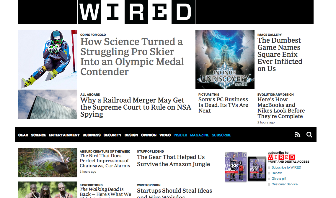
There are many different elements on the homepage of Wire, there are many different elements, but it doesn’t feel cluttered. They move against the norm by placing feature content above the navigation. (As seen above.) This can be slightly disorienting at first, but it is still above the fold of the page, so I believe it still works.
Line
There are lines throughout the home page. Literal lines are a part of the header, the navigation bar also works as a dividing line between feature and body content, and implied lines appear between the columns of text.
Color
The use of color is minimal throughout the homepage. There are colors pictures, and a minimal amount of the bright blue that used to be so prevalent (and still is in the smartphone app), but the colors most used are black and white.
![]()
![]()
Because of the grid-like layout and the asymmetrical layout (more on that later), it doesn’t feel boring. But then again, I’m a minimalist. Give me three colors and a blank space and I’m happy. 🙂
Shape
The shapes involved in the Wired homepage are very 2-dimensional and geometric. There are squares in the logo, and implied squares and rectangles throughout the home page. Or, if I remember my 5th grade geometry class correctly, I believe we can just say parallelograms and be over with it?
Form
Like the shapes involved, the form is very geometric. Form, though, is 3-dimensional, which the Wired website does not really show.
Texture
Um, yeah. No texture here, just pure, smooth, nerdy goodness.
Value
Value in this context is the relationship between light and dark on an object. Because of the 2-D look of the home page, there are no light to dark gradients, which keeps the design rather shallow.
The design may be shallow, but Wired’s homepage still catches the eye.
Analyzing a site according to principles, though, is different, as principles are theories used in the creation of a design.
Unity
There are aspects of unity within the design of Wired’s home page. The repetition of the implied grid lines and that, even though the pages change, there are still the same style of grid lines used throughout.
Balance
Wired’s website is asymmetrical, but not in a jarring way. If everything in life was symmetrical, design would get fairly boring. Instead, Wired has an asymmetrical design with the feature and body content on the left/middle, and other content on the right side. This is also used in the design of article pages, where the left/middle is dedicated to the content and the right is used to show links to other relevant content and the day’s top stories.


Emphasis
The emphasis of this page is focused on the feature content. The bright, action-packed picture draws your eye as the focal point of the page.

The eye moves to the feature story, then onto the other content.
Contrast
The stark black and white provide a strong contrast for the page, which helps all the design elements stand out.
Scale & Proportion
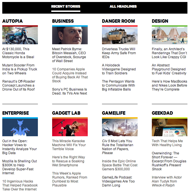
The imaginary grid that content lies in gets smaller as you move down the page. The feature content is large and attention grabbing, but the body content is smaller, and the secondary body content down further is even smaller and in a different type of grid, as you can see below. While there are many different sizes in the grid, it all works together and they are proportionate to each other and the importance of what they contain to make a cohesive page.

Just below the navigation bar. The grid begins to change and shrink.
Scrolling further down the page, the grid maintains the same general idea as above, but changes to fit more content.
Movement
Even though the homepage is stark, there are many components. When your eye moves away from the pages focal point, it begins to take in all the other articles and pictures, moving over and down the page.
Pattern & Repetition
The pattern of content is repetition in and of itself. The continuation of this pattern is seen throughout the homepage and the rest of the website. The side bars on all articles stay within the same design while the content changes. Weekdays the feature content design is consistent, and Saturday and Sunday bring the weekend edition of design, which is only slightly different.
The weekday layout for feature content.

The weekend layout. Notice the “Weekend Edition” text above the picture on the left.
Variety & Unity
Even though this website has a strong sense of unity throughout, there is variety in the small changes in the size of the grid pattern, and whether the cells are squares or rectangles. Could there be more variety? Possibly. But the unity is what brings it all together into a cohesive website with a neat, clean little bow on top.
While this is overall a simply design website, it is needed because of the large amount of content that Wired wants you to see on the homepage.
And now, a quote from Jony Ive, who’s design aesthetic I really admire. (Have I mentioned I’m an Apple fan-girl?)
“I think there is a profound and enduring beauty in simplicity; in clarity, in efficiency. True simplicity is derived from so much more than just the absence of clutter and ornamentation. It’s about bringing order to complexity.”
