Images and the Social Landscape

Social media. For some, it’s a way to vent, share silly happenings of their day, or ask questions. For others, it’s a valuable tool to reach their audience.

I’m part the latter group. Through my work with my University’s student radio station, I’ve learned many, many things about marketing, promotions, and how to best utilize the social landscape we rent (not own!) to reach our audiences.

Side note: I am by no means a master. I have a lot of experience yes, and I’ve helped clients with their social media presences, but I’m constantly learning and adapting as these sites grow and adapt.

images-sociallandscape

From my experience and research, images play a huge role. Not only did Facebook make its new layout very image-focused and Twitter added header photos and other image-focused changes, we as human beings are a very visual populace. An image catches our eye, makes us look twice, and creates an emotional response. From my experience, images garner the most engagement. Likes, comments, and shares. One time I saw a fellow student I didn’t know with one of my images as her profile picture. I was flattered, then annoyed since, you know, COPYRIGHTS!, then flattered again because I could see that the lyrics or verse (can’t remember which) meant enough to her that she wanted to make it her profile picture (I’m ignoring the whole profile picture discussion… 😉 ).

I have concrete analytics that show posts with pictures bring more engagement, which is what one of the goals is, after all. (The main goal should be interacting with your audience, not numbers. Numbers help, but that’s not the be all end all.)

Now, to the guts of the post. There are a number of things that I’ve found help when using images as part of a social strategy. Have more? Comment below! I love to hear new ideas. 🙂

  • Use the crop tool. While this is not as big of an issue anymore, I still think it’s important. Square images are utilized across Facebook, as well as Twitter. Oh, and that little app Instagram. Profile pictures, for example. This is especially important when it’s a company or organization, but make sure the image, if not square, looks halfway decent when cropped to the square that Facebook and Twitter do to profile pictures. BUT, the crop tool doesn’t just have to be square, either. Especially with the semi-recent changes to Facebook and Twitter. Find what works best for you, and use it. (Don’t forget to reevaluate occasionally, too!)
  • Look beyond Photoshop. Sure, Photoshop is the cool kid, but let’s be real, it’s a beast. I have Photoshop, I use Photoshop, I like (most of the time) Photoshop. But sometimes it’s not worth launching the program for a small little project. Enter PicMonkey. The base level of the site is free, and it’s grown to be more than just a picture editor. You don’t need hundreds of dollars worth of programs to make a great looking image for social media.
  • Like it or not, Pinterest is a thing. I read a lot of blogs, and many bloggers (at least in the health/fitness/food genre) utilize pinterest, and they always use an image in their blog that acts as the link to Pinterest, and the image seen throughout the site when people repin. I personally am not a Pinterest junkie (partially because I’ll waste too much time with home decor and DIY time wasting brainstorming). But, as a social media junkie, I realize the power it has. Especially if your target audience is on Pinterest.
  • More is not always better. This is two-fold. Don’t flood your poor followers’ feeds with images. Keep to the same schedule you are, but work to incorporate more images. Try adding one or two a day/week (depending on how much you typically post), then work up until nearly every post (that will benefit from an image) has an image.

Well, there’s definitely more, since this is way more than a one-post topic, but these are the most important aspects of images in the social landscape that I’ve seen. Any others that direly need to be said?

5 Tips to Maximize Usability

Usability is undoubtedly one of today’s top buzzwords. And for good reason. Nielsen Norman Group (NNG), one of the premier authorities of usability (headed up by the “usability guru” Jakob Nielsen), defines usability as:

[a] quality attribute that assesses how easy user interfaces are to use.

As stated by NNG, there are 5 components to create high levels of usability:

  • Learnability: How easy it is for first-time users to navigate?
  • Efficiency: How quickly users can perform tasks?
  • Memorability: How easy is it for users to become familiar with the design on a later visit?
  • Errors: What are the errors, how bad were they, and can the users recover?
  • Satisfaction: Is the website engaging and pleasant to use?

There are many more components, but that’s a working knowledge of usability. The link above goes to a great article by NNG on the subject. (Including the 5Ws and an H.) When working with a website, whether the designer or the project manager, it’s crucial to remember that the user comes first. What could be a great design aesthetic could potentially harm the usability of the website, which may just lead to you ending up on this site. (Always a fun but exasperating read.)

Here are 5 tips to maximize usability. Some are easy to accomplish, while others can take some work. Design, like many things in life, is a work in progress. Every designer changes, gains better skills, and thinks their earlier work is horrible (been there!). As long as you maintain small changes over time, you’ll be in good shape!

1. Don’t change a great idea for the sake of creativity.

Follow the old cliche adage, “if it ain’t broke, don’t fix it”. Another NNG article instructs readers to “build on existing mental models”. Essentially, users build their knowledge on past experience. If you forego any principles of design, you’ll lose visitors because your site is clunky and hard to use.

For example, navigation bars. Nearly every website has their main navigation bar across the top of their screen. There’s a reason for this. When you go to a website for the first time, and you want to look to read about the company, where do you look? I would hope you’d say somewhere in the navigation bar, although some also place it in the footer. (If you didn’t, lets chat. I want to know what you do and I seemingly don’t. 😉 )

NNG's header and navigation areas - pretty standard, right? Standard is the goal for this particular area of a web page.

NNG’s header and navigation areas – pretty standard, right? Standard is the goal for this particular area of a web page.

Cedarville's navigation bar, plus an additional, less noticeable, one for students, faculty, and other groups. The website is targeted to visitors, not students, so the primary navigation bar is dedicated to giving information about the school.

Cedarville’s navigation bar, plus an additional, less noticeable, one for students, faculty, and other groups. The website is targeted to visitors, not students, so the primary navigation bar is dedicated to giving information about the school.

And, lastly, Twitter's. Like Facebook, there are sidebar menus, but the most important links are in the navigation bar at the top.

And, lastly, Twitter’s. Like Facebook, there are sidebar menus, but the most important links are in the navigation bar at the top.

2. Go the way of the buffalo minimalist.

Granted, this is written by a minimalist, so you may beg to differ. However, another part of the same NNG article as above vetoed the idea of clutter. It’s perfectly fine to have typography, images, and more to make the website visually appealing and interesting, but make sure it doesn’t become too cluttered.

Always keep the user in mind. Is it easy to find the necessary information? Is finding the search bar a quick process? Answering these questions can help you maintain a visually appealing yet usable website.

3. Test, then re-test.

Try to periodically look at your website with fresh eyes. Invite coworkers or friends/family to engage with the website and see what, if any, design flaws they encounter. Are they having trouble finding the search bar, or are they unable to work the image gallery? By recognizing the problems a site may have, you can begin the process of fixing it.

4. What the f…shaped pattern?

The F-shaped pattern is a term from eye-tracking studies. When a person looks at a website, their eyes move in an F-shaped pattern. They take in the header/navigation bar, the feature area of the page, and the left side of the feature content, and continues to look less and less at the right side of the page. Some websites may not have as a defined shape as others, but this is a good guideline to remember as you’re working to design or modify a website.

5. Less time, money, and work may not be worth it.

Sometimes, less time and less work won’t pay off. Sure, you’re probably paying less, but putting the effort into making a mobile-friendly site can pay off. It all depends on your targeted audience, which is another topic for another day, but if you can swing it, work to incorporate a separate mobile HTML that appears through device detection. (More on this here.)

Usability changes on a mobile device, especially with the swiping motion that accompanies it. This doesn’t have to be an overnight change. Some businesses can’t make it work financially or otherwise, but it’s something to work towards.


Do you have other ways to maximize usability? I want to hear! I’m always looking for new tips and tricks. 🙂 – Hannah

HTML, CSS, and the Struggle Bus

Coming into this class, I had a decent understanding of HTML, and a basic understanding of CSS. I’ve enjoyed learning more about both, and even though at times it’s been rather infuriating, it’s cool to see words and random symbols create a working (sometimes) website!

a20a0adec6f4b2d9822846381f9aa637b8429d3a0464d0a6b7d84d81accb32b5


Not new on the interwebz, but it’s especially entertaining now that I know more coding and have experienced this.

That being said, there are still some parts I can’t quite grasp, which usually means consulting the Google, or going to W3Schools (fantastic resource, by the way).

My HTML seat on the proverbial strugglebus is the <div> tag.

  • In my mind, there’s no logical reason that a container/box in HTML would be called a div. I may be in the minority, but it’s definitely one of the harder tags to remember. However, once we started coding in Dreamweaver, it made more sense, because there’s a visual representation of the code. As a visual learner, this is really helpful.
  • The <div> tag essentially creates a division in an HTML document. (Per W3School’s definition.) When working with a CSS document, divs can be used to format elements. For example, a header div in one’s HTML document can be referenced in the corresponding CSS document to change the color, font, gradient, etc etc.

Alternatively, the CSS seat is taken by selectors.

  • There are so many different terms between HTML and CSS that it’s nearly impossible to remember what each does within the first few months of coding. A selector (again using W3School’s as a reference) is a “pattern” used to select the element you want to style.
  • A “#” (I kick myself every time I call it a “hashtag” not a “pound sign” – just an example of how much a website can insert itself into culture and everyday vernacular) for example is an ID for elements in the HTML document. So when typing #header { background-color:grey; } into the CSS document, the header div will change color.
  • Another selector is “.”, which is class. This is generally used in the same way as an ID. When used, it will style all elements with the corresponding class, like .hometown. The “hometown” section of the HTML will be styled the desired way.
  • While those are the two most common selectors, there are many others. All selectors are essentially selecting parts of the HTML code to style. Fancy that, eh? Selectors select? 🙂

While coding can definitely be frustrating at times, it’s been a great thing to learn and I’m looking forward to having a finished product of my portfolio!

Live Tweets: Basically an Excuse to Tweet a Lot

On Friday night, I attended “Arts Madness” on campus. As part of the class this blog is for, each student has to complete a “live tweet” coverage of an event. I was planning on live tweeting the film festival I was helping to organize with some friends, but that ended up not happening. (Long story, we’re mostly not bitter….) I almost chose to live tweet the Oscars, since I had already planned on watching it while home on spring break. I tweeted, but not to the extent required for the assignment (it was mostly all snarky… I mean, that’s me in a nutshell.)

ap-nutshell

Always wanting to have fun, Austin. That’s you in a nutshell! Austin Powers: No, this is me in a nutshell. Help! I’m in a nutshell! How did I get into this nutshell? Look at the size of this bloody great big nutshell!

Sorry, had to. Such a great line…

Anyways, I was struggling to find something that I could actually attend that worked with my class and work schedule since these last weeks of the semester are crazy. I can’t live tweet ELLIV (an end of year concert at Cedarville) since I’m stage managing it, and that just ain’t gonna work. Then, Arts Madness happened!

There were two different places in the student center that held concerts, and I chose the option in the Hive (okay, it was the free option, college student here). There were two ensembles, the Vocal Arts Ensemble and the NAfME ensemble, as well as a harp ensemble to close out the event.

IMG_1474

I consider myself a fairly frequent tweeter, but it all depends on the day and what’s happening. I don’t think I’ve ever tweeted that much in an hour and a half.

I lost a follower.

Note: I’m assuming it’s one of those random people that I don’t even know that started following me for no reason? Or maybe my Lit teacher from high school who I also don’t know why she started following me? Either way, its nothing to lose sleep over. 

It was actually kind of fun, but I did feel slightly bad for those following me…

Back to the real issue at hand – the concert!

Even though I’m not a huge fan of the styles of music they played, there’s no doubt these students are talented. There was a good mixture of songs, and some were acapella while others were accompanied by a pianist.

It was a pretty small room and while the room was full, I still felt awkward looking at my phone every few minutes to tweet again.

Screen Shot 2014-03-30 at 12.48.14 PM

Switching gears slightly, there was no designated hashtag that I saw for the event, so I began using #CUpopsconcert and #artsmadness. I forgot a few times and didn’t add it and there were times I didn’t have enough characters, but most of my tweets had one or the other (or both) of those hashtags. 

Screen Shot 2014-03-30 at 1.01.25 PM

Screen Shot 2014-03-30 at 12.47.10 PM

Screen Shot 2014-03-30 at 12.46.49 PM

I think live tweets are an interesting way to see an event. On one hand it’s great to have the feeling of being there without actually being there, but on the other hand, it’s through  an individual’s perspective, so there could be missing pieces of information or skewed information (intentionally or unintentionally).

I don’t see myself doing a live tweet of this magnitude (ie, regular updates about the happenings of an event, rather than occasional remarks on the matter) all the time unless it’s for a job, but it was definitely a fun and interesting learning experience.

Screen Shot 2014-03-30 at 12.46.35 PM

While there were a few tweets the got favorited, I was most amused by a friend favoriting my last one. 🙂

Spring Break is Here!

Side note: Last year, some friends and I went to a cabin in the woods (Yes, we thought about that movie the whole time and at one point thought we may not survive the drive there. Somewhat melodramatic, but it was a tad creepy.) The entire time, when someone said “spring break”, we’d all respond, “SPRINGBREAK!”.

It was hard to resist not using that as the title. I figured it probably wouldn’t be very good technique… 🙂

Anyways, yes, spring break is here and I’m loving it. I got home (near Philly, PA) Friday night, and have been enjoying family time since!

What has already happened:

– Watched the Oscars live for the first time in many years! I had Twitter (watching #Oscars and #Oscars2014 hashtags like the nerd I am), my cat, food, and two parents who kept asking questions.

Cats have hard lives, don't they?

Cats have hard lives, don’t they?

– Mah birthday! It was actually yesterday (Tuesday), but I’m going to dinner with my parents and brother tonight to celebrate. Last night was dinner and Back to the Future with my dad – that movie never gets old!

“Heavy…” “Weight has nothing to do with it!”

1958334_10151908917047352_612882352_n

Flowers from my dad – a nice surprise!

Raw, gluten-free chocolate tart (it's actually pretty healthy - and really delicious!)

Raw, gluten-free chocolate tart (it’s actually pretty healthy – and really delicious!)


– Veg time. Way too much Netflix and Hulu, but I consider it a good few days rest before launching into some schoolwork for the rest of the week.

– Doctor’s appointment. I have long-term knee problems from a snowboarding injury (sadly, it’s not as epic as it sounds…), and while I may need surgery in the near future, I got the okay to run again! My birthday present was a new pair of running shoes, which is also making me motivated to try and make it work again

Close to what I got - mine are more obnoxiously bright though. Hehe...

Close to what I got – mine are more obnoxiously bright though. Hehe…

(Source)

– Last interview for a summer internship. It’s looking promising, but I’m still nervous to hear. Hopefully I’ll get an answer within the next few days!

– A calm, serene walk at a lake near my house. The paths were almost completely covered with snow and ice, but I got a little exercise in, at least while breaking in my new running shoes.

IMG_1386

Still to come:

– Hiking with a friend. I’ve been wanting to take my camera to Hawk Mountain for a few years now, and the weather is looking decent for Friday, so my friend and I are going hiking and climbing over rocks – hoping it’s not too muddy and cold!

– Dinner with friends. I’m fortunate enough to catch up with some good friends this weekend before I head back, and I’m really looking forward to it! Good food and good friends – what’s better?

– A really long drive back to campus. Basically, it’s a long drive with the PA turnpike’s many potholes and construction zones. Non-Pennsylvanian’s don’t know how good they’ve got it.. 😉

F94v3yf


(Source)

There you have it! Even it’s been (and will be) an awesome break, in a way I’m excited to get back to it at school with – hopefully – a renewed motivation for schoolwork!

Photoshop Olympics

As the… real Olympics (or as I called it when I was little and my family loves to remind me, the “ink-nets”) draws to a close, here are my gold, silver, and bronze awards for one of the designer’s main tools, Photoshop.

Sorry, had to.

Sorry, had to.

(Source)

Gold: Layers

While it’s hard to get used to at first, layers turn into your best friend. Or worst if you start working on the wrong layer, but let’s be positive, shall we? When working in almost any other design software, whether it be Pic Monkey, Keynote, or Fireworks, clicking on an item will allow you to modify and move. But with Photoshop, whatever layer is selected is the one that can be modified or moved.

Beyond that, there are capabilities for groups, linked layers, and easy ways to duplicate, hide, or delete layers. Sure, it can drive you crazy at first, but layers soon enough become your best friend!

Silver: Zoom

Most of my projects these days are large but detail oriented. Therefore, the zoom shortcuts (Command + or Command + on a OS X, control if using… the other one 😉 definitely come in handy. Perhaps the best part about this is that it’s fairly universal. It can be used in a number of other programs, like Chrome, which allows you to learn one shortcut and use it for multiple programs.

Except Pro Tools. Command + = is change mix/edit window, not zoom. Continually messes with me.

When combined with pressing the space bar while clicking to move the canvas either horizontally or vertically (or diagonally, it’s not picky), these are two powerful shortcuts that are worthy of a medal.

Bronze: the power to constantly be learning

Ok, so this isn’t necessarily a tool, and could be higher up in the ranking, but what I love (and simultaneously dislike) about Photoshop is that while I consider myself an intermediate Photoshop user, I’m still always finding new ways to do things. It’s such a powerful tool, and I’m always teaching myself new tricks and new ways to design, while also teaching myself more design techniques.

Sure, it can be aggravating, but once you figure out how to do something and it then becomes second nature, the hair-pulling was worth it.

These medals may not have pieces of a meteor in them, but hey, Photoshop, I still think you’re rad.

The Redesign Begins

Dundundun dun………

When looking at options for my website redesign project, I wanted something that would challenge me, but also wouldn’t be nearly impossible to fix. 1927 Events’ website is that mix of a good challenge while remaining realistic.

The premise of this project was to essentially take a website with a bad design and fix it. Easy right?

Not so much.

Even though the website is, let’s just say, not a designer’s dream, there are still elements that should be kept in order to maintain the branding and image the company has worked to create.

What to Keep

Logo – A company’s logo is crucial to their image and company branding. Their’s is a relatively simple logo, but it is still the face of their company and is prominent in the site’s design.

1927events-logo

Photography – I love the photography they feature on their site. I definitely want to keep the photography, but simply utilize it in a different way.

1927events-gallery

Fonts – The overall idea of the fonts used should be kept, but the size in some parts should change. For example, the Contact page’s font size could increase slightly. It’s readable, but that’s with my uber strong contacts in and slowing down my reading pace.

Impromptu eye exam, anyone?

Impromptu eye exam, anyone?

Social Media – There are Facebook and Twitter buttons at the footer. 1927 Events has a decent presence on Yelp, which could be another button to add, as well as making these more prominent.

1927events-footer

What to Change

This website is essentially one page. Changing this will help ease confusion amongst visitors and help it adhere to standard website design. There are a few elements that should be kept but made into their own pages:

Contact (with map)

1927events-contact

1927events-map

Options (with floor plan)

1927events-floorplan

Elements to Change

As mentioned above, the largest change that needs to be made is the division of content into pages. By making it more than one page users won’t have to continually scroll down, they will be able to navigate directly to the pages they want to see.

The “navigation bar” (although that’s saying a lot) on the right hand side is not very user-friendly. By placing the navigation bar at the top featuring the new pages, the ease of use will increase. This is an example of “if it ain’t broke don’t fix it” design. Some elements, like the navigation bar, should be left in the standard place to minimize user’s irritation with your design and jump rate.

1927events-navbar

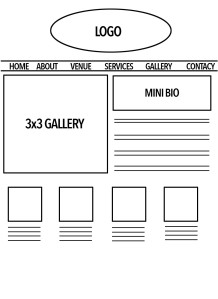
Now that I’ve talked about how I’m planning on changing this website for the better, here are my wireframes for the new home page design. Though there are definitely elements that should be kept, the overall design should change. They “broke the rules” regarding design, but it didn’t help them. I’ll work to keep the overall feel the same but to make it more user-friendly.

Idea #1:

1927events_wf03


Idea #2:

1927events_wf02


Idea #3:

1927events_wf01


(“Contact” will be spelled correctly in the final design. Promise.)

Stay tuned for updates!

Variety within the Unity

Wired appeals to my nerdy side. There, I said it. I’m a not-so-closeted nerd. I enjoy reading about Apple’s newest ideas (whether good or bad, I’m an Apple fan to the core), scientific breakthroughs (as long as it doesn’t get too deep. Not a science fan.), and their fun little random techy articles that pop up on my Twitter feed.

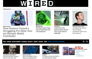
When looking at Wired’s website from the design vantage point, I appreciate it even more. Some may say it looks stark, and to a point it does. But I can appreciate the complicated simplicity (if that makes sense). When you first visit their site, it can look barebones. But when you look at it through a lens of design elements and principles, it’s easy to pick out why it’s design is the way it is, and that there really is some complexity in this design. The simplicity and complexity work together to create a website that is user-friendly.

Screen Shot 2014-02-07 at 11.50.43 AM

Side note: I’m a minimalist when it comes to design, so I can appreciate Wired’s design and the simplicity of it, but I realize that that’s the way my mind works and not everyone loves the simplistic approach. 🙂

It’s fairly simple to analyze this site according to design elements.

Space

There are many different elements on the homepage of Wire, there are many different elements, but it doesn’t feel cluttered. They move against the norm by placing feature content above the navigation. (As seen above.) This can be slightly disorienting at first, but it is still above the fold of the page, so I believe it still works.

Line

There are lines throughout the home page. Literal lines are a part of the header, the navigation bar also works as a dividing line between feature and body content, and implied lines appear between the columns of text.

Screen Shot 2014-02-10 at 10.34.32 AM

Color

The use of color is minimal throughout the homepage. There are colors pictures, and a minimal amount of the bright blue that used to be so prevalent (and still is in the smartphone app), but the colors most used are black and white.

Screen Shot 2014-02-10 at 10.47.09 AM

Screen Shot 2014-02-10 at 10.34.01 AM

Because of the grid-like layout and the asymmetrical layout (more on that later), it doesn’t feel boring. But then again, I’m a minimalist. Give me three colors and a blank space and I’m happy. 🙂

Shape

The shapes involved in the Wired homepage are very 2-dimensional and geometric. There are squares in the logo, and implied squares and rectangles throughout the home page. Or, if I remember my 5th grade geometry class correctly, I believe we can just say parallelograms and be over with it?

Form

Like the shapes involved, the form is very geometric. Form, though, is 3-dimensional, which the Wired website does not really show.

Texture

Um, yeah. No texture here, just pure, smooth, nerdy goodness.

Value

Value in this context is the relationship between light and dark on an object. Because of the 2-D look of the home page, there are no light to dark gradients, which keeps the design rather shallow.

Screen Shot 2014-02-07 at 11.50.43 AM

The design may be shallow, but Wired’s homepage still catches the eye.

Analyzing a site according to principles, though, is different, as principles are theories used in the creation of a design.

Unity

There are aspects of unity within the design of Wired’s home page. The repetition of the implied grid lines and that, even though the pages change, there are still the same style of grid lines used throughout.

Balance

Wired’s website is asymmetrical, but not in a jarring way. If everything in life was symmetrical, design would get fairly boring. Instead, Wired has an asymmetrical design with the feature and body content on the left/middle, and other content on the right side. This is also used in the design of article pages, where the left/middle is dedicated to the content and the right is used to show links to other relevant content and the day’s top stories.

Screen Shot 2014-02-10 at 10.49.23 AM

Screen Shot 2014-02-10 at 10.49.34 AM

Emphasis

The emphasis of this page is focused on the feature content. The bright, action-packed picture draws your eye as the focal point of the page.

The eye moves to the feature story, then onto the other content.

The eye moves to the feature story, then onto the other content.

Contrast

The stark black and white provide a strong contrast for the page, which helps all the design elements stand out.

Scale & Proportion

The imaginary grid that content lies in gets smaller as you move down the page. The feature content is large and attention grabbing, but the body content is smaller, and the secondary body content down further is even smaller and in a different type of grid, as you can see below. While there are many different sizes in the grid, it all works together and they are proportionate to each other and the importance of what they contain to make a cohesive page.

Just below the navigation bar. The grid begins to change and shrink.

Just below the navigation bar. The grid begins to change and shrink.

Scrolling further down the page, the grid maintains the same general idea as above, but changes to fit more content.

Movement

Even though the homepage is stark, there are many components. When your eye moves away from the pages focal point, it begins to take in all the other articles and pictures, moving over and down the page.

Pattern & Repetition

The pattern of content is repetition in and of itself. The continuation of this pattern is seen throughout the homepage and the rest of the website. The side bars on all articles stay within the same design while the content changes. Weekdays the feature content design is consistent, and Saturday and Sunday bring the weekend edition of design, which is only slightly different.

The weekday layout for feature content.

The weekday layout for feature content.

The weekend layout.

The weekend layout. Notice the “Weekend Edition” text above the picture on the left.

Variety & Unity

Even though this website has a strong sense of unity throughout, there is variety in the small changes in the size of the grid pattern, and whether the cells are squares or rectangles. Could there be more variety? Possibly. But the unity is what brings it all together into a cohesive website with a neat, clean little bow on top.

While this is overall a simply design website, it is needed because of the large amount of content that Wired wants you to see on the homepage.

And now, a quote from Jony Ive, who’s design aesthetic I really admire. (Have I mentioned I’m an Apple fan-girl?)

“I think there is a profound and enduring beauty in simplicity; in clarity, in efficiency. True simplicity is derived from so much more than just the absence of clutter and ornamentation. It’s about bringing order to complexity.”

Content Matters, But Writing Does Too

The mobile vs. laptop debate is nothing new, but it’s definitely changing. It’s becoming more popular for people to read web content on their mobile device instead of pulling out their laptop or (gasp!) turning on their desktop computer. Suzanne Youngblood for the EnVeritas Group writes in this article on how to write for mobile websites.

Reflecting on how much her own habits have changed since she purchased a smartphone, she give four points on writing strong mobile content.

“Keep it simple.”

She has written before on this topic, and she is a strong believer of writing concisely. (Which is something all writers can work on, not just those writing mobile content.) As she demonstrates in the article, using bullets for lists is a good way to remain concise. Short paragraphs also help those reading on mobile devices.

“Don’t necessarily rehash what’s on your desktop site.”

Youngblood even mentioned Jakob Nielsen, as she shares his view on how one website doesn’t always fit all needs. It’s important to write content that is specifically written and formatted for a mobile screen, but giving them the option of the full website is also important for those who want more information.

IMG_2905

The Cedarville University mobile site has the same design elements, but it optimized for mobile platforms.

While the Cedarville University mobile site does not have a link to the full version, there are only blurbs below article titles, allowing users to click through if they want to read more.

While the mobile site does not have a link to the full version, there are only blurbs below article titles, allowing users to click through if they want to read more.

“Make it easy for mobile users to find what they’re looking for.”

Scanning is the new reading. Many users scan content on either an app or browser while waiting for an oil change, getting coffee, or a myriad of other reasons. Brief headlines, scannable text, and even contact information should be included on the main page, with secondary content a click (well, touch?) away.

“Don’t forget about SEO.”

SEO (Search Engine Optimization) is still crucial. Content should still be optimized for search; Youngblood cites a study that shows 1 in 3 mobile searches are local, and that 61% of those users called a business. This means users are out on the town, looking up restaurants, businesses, and other local information. SEO will also help a website show higher in the results, making it more likely people will go to the link on a smaller screen.

She finishes with a quote that is crucial for mobile writers to think of every time they sit down to type: “Content is where your mobile page will succeed or fail.”

Three Voices, One Event

There are no shortages of commentary on the 56th GRAMMY Awards. What was great, what was awkward, and what just didn’t work. Three different news outlets provided different types of coverage of the night, and each had it’s own voice and take on the show.

The Professional

CNN’s coverage stayed true to their standard voice: professional and straight-forward. Their list format of the top five aspects of the show was to the point and made it easy to read. The top points were bolded, and caught my eye so I could easily scan the article to read what I wanted. Like most awards shows, there are a lot more than five memorable moments, but they stuck to the highlights. Some were more general, like “The new faces did well” in regards to artists like Macklemore & Ryan Lewis and Lorde, and others were more specific, like “Pharrell’s hat”. (Really. There’s multiple Twitter accounts dedicated to it.)


The Irreverent

The LA Times’ piece was less formatted than CNN’s, and definitely wandered towards the irreverent at times. While they had very extensive coverage and it was broken into smaller paragraphs, there were no headings to distinguish the different portions of the article. They did, though, include a wide variety of pictures from the event at the top of the article. They loaded quickly and were user-friendly, which is something I look for in an article. (Loading the whole page for each new picture? Uh-uh.) However, it ended strong, and gave a good overall view of the event, even with the lack of scannability.


The Play-by-Play

The Guardian’s play-by-play coverage brought the typical British sense of humour to live coverage of the GRAMMYs. It’s easy to read, with the times on the left and blocks of text in the center. The article begins with a background on this year’s GRAMMYs and what they’ve been told to expect. As the night goes on, there were quotes, pictures, and embedded YouTube videos. The entries get shorter, as well, with a bolded “Winner!” and a brief paragraph about the artist. Some focused on their performance, some on their year, and some about their acceptance speech.

Out of the three, The Guardian’s coverage was my favorite, mostly due to the play-by-play structure, though all had good points and covered the GRAMMYs well.